
Making Time Travel an Accessible Reality
Designing a Responsive Travel Booking Site

Overview
Time travel tourism is now finally a reality with this concept of Virgin’s latest endeavor, Zeit. Zeit will be offering travel packages to different times in 289 destinations around the world. Travelers will be able to read through trip options and book their preferred time and space online.
To achieve this, Zeit requires a responsive ecommerce website that best displays trip options and packages, as well as fresh branding that bridges the gap between historical landscapes and modern technology.
My Role
Research
Info Architecture
Wireframing
Branding
UI Design
Prototyping
Assumptions
Modern travelers want a more unique, engaging travel experience than ever before
A brand new travel concept requires user trust
How might we create a comfortable booking experience to convert users towards an unfamiliar travel concept?

The Research
Goals
Understand travelers’ motivations for selecting their travel destinations
Identify the target market for time and space travel
Build user trust for brand-new product and concept
Unpack users’ pain points in booking sites and travel planning
Competitive Analysis
Time travel doesn’t currently exist, and, therefore, there is no direct competition to analyze. These are Zeit’s top indirect competitors - selected for either their dominance in the online travel booking world, or their unique experiences offered.

Takeaways
Booking.com is one of the world’s leading digital travel companies, with Airbnb becoming a key player with a modern, alternative approach.
Zeit’s website will have to use the key UI elements of these industry giants, while also establishing itself apart as an innovative, disrupter in travel.
Although we can look to Space Adventures and Virgin Galactic for space travel inspiration and expertise, these companies ultimately do not have bookable trips at the moment to truly understand their landscape.
User reviews, traveler photos, and travel protection/insurance build business credibility and user trust
1:1 Interviews
Interviews were conducted to deepen understanding of users’ behaviors, attitudes, and expectations towards travel/time travel. Participants were 5 individuals aged 26+ with middle to high income earnings, who travel at least 1x per year, and use online booking systems or travel agencies
Key Findings
All participants seemed to have an idea of where they wanted to go prior to doing online research, and the research done was to simply figure out the logistics of getting there and staying there. Price/value would then be an ultimate deciding factor. All participants expressed using travel to enrich their lives via history and culture, while the retired male participant also focuses on enhancing his relationships with the people he travels with.
· 5/5 participants live active lifestyles, mentioning physical activity on vacation itinerary
· 5/5 participants look forward to new and exciting cuisine on their travels
· 5/5 participants try to book 3 months in advance if possible
· 5/5 participants rely on reviews and photos from other travelers
Persona
Born from research, Katie is our target user - a millennial who works hard, plays hard, and seeks to enrich her life with experiential travel.
Information Architecture
With 289 destinations and experiences offered with Zeit, how will information be best displayed for users?
Card Sorting Goals
Understand how potential users organize information
Learn how to organize Zeit content according to user thinking
Card Sorting Findings
4/6 participants grouped U.S. events together as separate category
6/6 participants grouped by time period and specific era
4/6 participants created separate category for landmarks and sites
3/6 participants did not understand or recognize card labels, ultimately having trouble with the exercise. This was informative, to suggest trip names and categories should be named more simplistic.

6 participants were presented with 20 cards via OptimalSort

Participants created a total of 31 categories, with a medium of 5 categories each.

Similarity Matrix shows how participants thought to group cards together
Site Map
The site map was created based on user findings in the interviews and card sorting exercise, prioritizing not only the information that users want, but will understand. This helps to visualize the organization of the content to be featured.
Task Flow
Since a major business goal of Zeit is to convert users into customers and increase revenue, a task flow was created to show how users will get from the browsing the homepage to confirming their booking details.
User Flow
Having a good understanding of our users, the user flow created considers all the pathways the user will potentially take as they navigate through the site. The user flow begins with our persona, Katie, finding Zeit through a social media ad - a realistic way she will discover Zeit, due to her friends’ posts and recommendations.
Wireframes
Information was further visualized via wireframing, giving us a clear overview of how the designs for the site will work.


UI
Branding
When designing the logo, the obvious choice was to incorporate a clock or a rocket ship, or something insinuating time travel. To avoid this cliche, I played around with wordmarks that seemed zippy and fresh. I began designing with the following logo:

After putting together imagery and further UI, however, this logo did not fit with historical architecture, and ended up making the UI look sloppy. A couple of iterations later, I found this logo to be strong, structured, and naturally lends the ability to fit in any time frame.

UI Kit
Colors and imagery chosen keeps it clean and professional, yet engaging and playful. It was a delicate dance to not have the site look like a history website, and this was achieved through vibrancy.
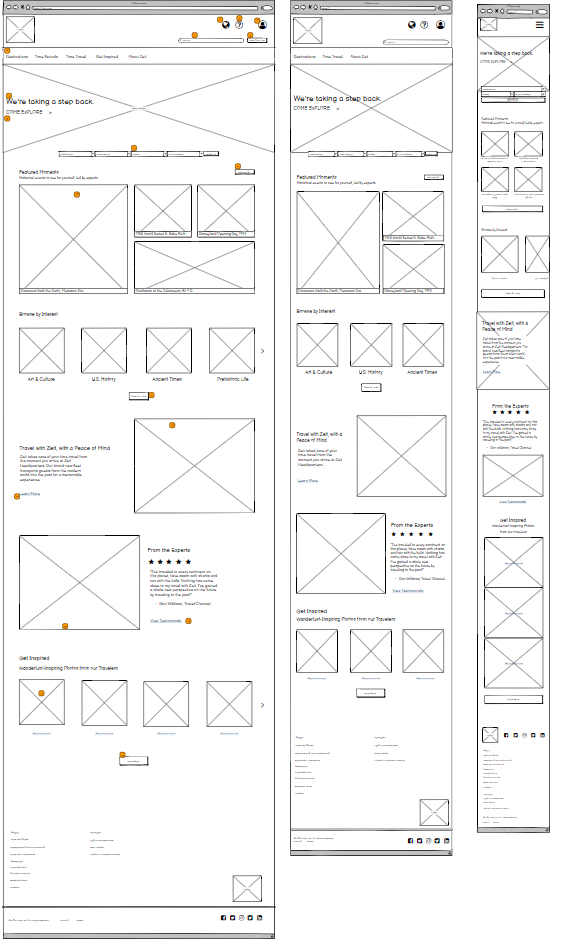
Putting it all Together
Homepage: Desktop, Tablet, Mobile


Putting it all Together
Trip Page: Desktop, Tablet, Mobile


Putting it all Together
Prototype
Testing the Prototype
Affinity Map - based on results of User Testing
Next Steps
Make iterations based on initial user testing
Continue testing, iterating as necessary
Expand designs to include booking/checkout pages
Takeaways
Designing for a made-up concept seemed difficult until I related it to what we have in reality - modern online travel. It shows that UX design is not meant to reinvent the wheel, but to take familiar patterns to illicit comfort and trust to users.
Travel is something sacred to many people and this process proved the experience and emotions can begin long before arriving at the destination.
Fin.